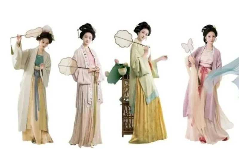
At first glance, the scene looks simple: a model beside flowering branches, a round fan in her hand, pale cloth moving in late-afternoon air. Yet the detail that keeps pulling me back is not the hem in flight. It is the outfit after the breeze leaves. That still frame explains why Song Style holds attention. It does not rely on a filter or a lucky angle. It arranges color, cloth, body and empty space with enough order to feel relaxed.
Bones Before Air
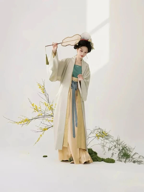
A flying sleeve can fake lightness for a second. When the wind stops, loose layers often collapse into a soft heap. The Song approach starts with structure. A long robe drops two quiet vertical lines; the chest wrap, ties and skirt narrow step by step. Wide sleeves loosen the shape, while the front edge gathers it.
This is why Hanfu styling in this mood can look calm rather than fragile. The garment has weight, but it does not swell outward. Its lightness comes from clear bones: seams, layers and length. The body is read before the fabric is noticed, and that order survives motion.
A dress that only works mid-spin belongs to photography. A dress that stands still, then walks, then turns, belongs to a day. The vertical line does not need drama. It gives the eye a path. When air returns, the cloth moves along that path instead of fighting it.
Color Has Rank
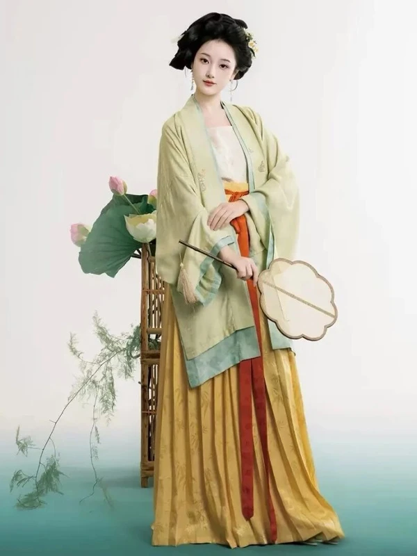
People often blame pale colors for the calm look, then copy the surface. They wash every shade toward grey. The result can feel tired, not refined. The stronger lesson is rank. One color sets the mood, a second builds depth, and a small third gives the eye a spark.
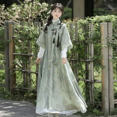
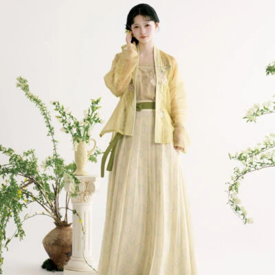
Lotus green can sit above ginger yellow, with a narrow vermilion orange line at the waist. The green holds the upper body, the yellow spreads below, and the orange appears only as a short vertical mark. Large areas carry character; small areas wake the look without shouting.
Goose yellow and dusty pink follow the same logic. Cream and grey olive steady the bright yellow. Pink takes space, but it stays low, away from the face. No single hue tries to do every job. That division keeps the eye fresh.
Details Delay
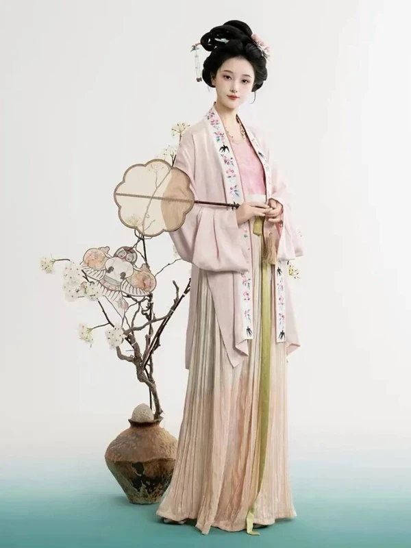
Some outfits show everything at once: huge embroidery, hard contrast, a dramatic silhouette. The first second is strong, and the second second repeats it. Song styling lets the eye move. At first the whole body seems quiet. Then a thin embroidered edge appears at the collar.
On one soft pink set, the real event is a narrow border. Flowers and swallows are pressed into a small strip. It guides sight from shoulder to hem without breaking the calm field of the robe. The detail is small, but it changes how the cloth is read.
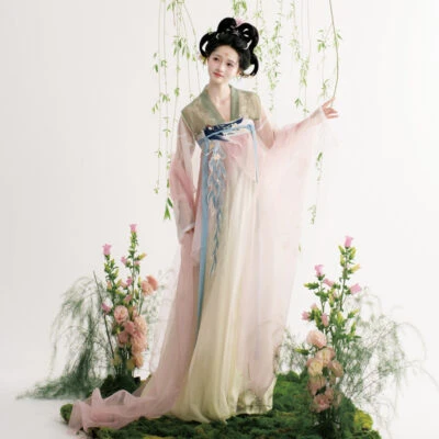
A lotus-pink look works the same way. From afar it is gentle; up close, the outer robe has texture, the inner layer and skirt carry faint patterns, and a bean-paste sash lands like a heavier pause. Pink avoids becoming empty sweetness because the eye keeps finding new information.
Room to Breathe
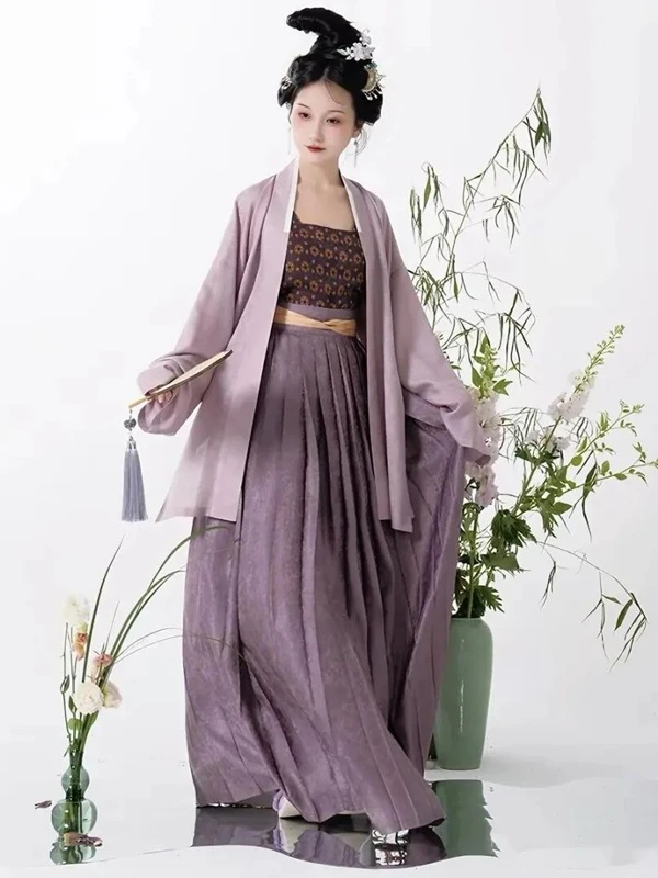
Empty space is often treated as a background color. In clothing, it is a boundary. If the collar has embroidery, the body can stay quiet. If the skirt has hidden pattern, the top needs fewer decorations. If the waist carries a bright note, the hairpin and fan do not need to compete.
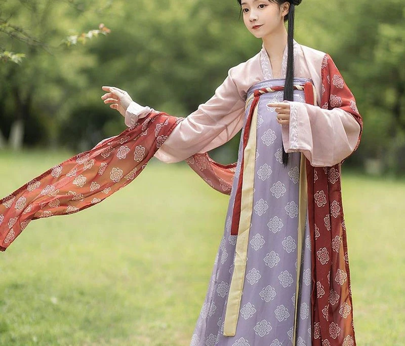
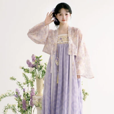
A smoky purple set makes this clear. Purple covers a large area, and the inner layer uses a dark small motif. A pale sash cuts the upper and lower zones, while the plain outer robe gives the pattern room. Several details exist, yet one point holds the focus.
This is how wide sleeves, long coats, layered skirts and woven textures can share one outfit without turning into clutter. Space is not absence. It is a frame around the important part. With a frame, an extra layer can stay calm. Without one, even two elements may argue.
Clothes Serve People
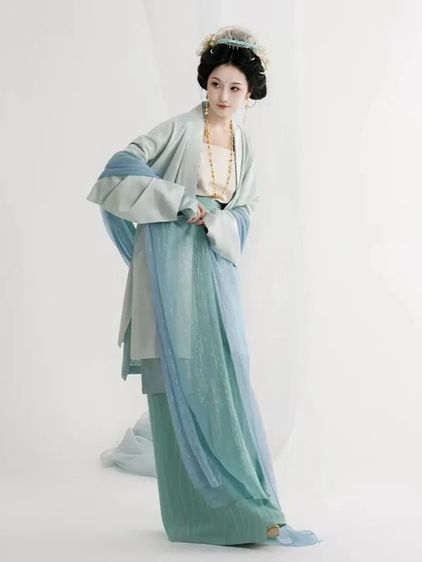
The most overlooked reason the style lasts is simple: it lets a person wear the clothes. The waist is not cinched into a role. The shoulder is not built into a costume. A long coat falls with the body, and sleeves open as arms move. Standing, walking, turning and holding a fan all remain possible.
A water-blue set proves the point. In motion it catches air; at rest it still looks comfortable. The support comes from inner and outer layers, long and short lines, and the way looseness is placed. The wearer does not become a mannequin for a scene.
That looseness invites ordinary life. One can picture the outfit in a courtyard, by a window, carrying a lamp, or doing nothing at all. It is not locked to one makeup look or one photo set. Beauty that survives after the retouching ends is the kind that stays.
The so‑called clean aura is ease born of a sense of order.
Looking back at this point, you’ll find the “cleanliness” of these garments does not only come from pale hues and sheer gauze. It springs from a few well‑balanced relationships.
1. Loose & Tight: Wide sleeves and full skirts offer freedom of flow; narrow lapels and thin ties bring restraint.
2. Light & Heavy: Sheer gauze layers on the outside to drift softly, while sturdier inner fabric holds the silhouette steady.
3. Plain & Patterned: Large plain areas let the eye rest; small patterned details reward close observation.
4. Main & Accent: The dominant tone sets the mood, secondary tones add depth, and pop colors inject a spark of vitality.
5. Wearer & Garment: The clothing has its own structure, yet it never turns the wearer into merely a display prop.
Once these relationships are balanced, the whole composition breathes. It is not blank, nor faint. Every element knows exactly where it belongs.